what is candlestick charts- how does candlestick charts work-simple tutorial
Explore the basics of candlestick charts in this straightforward tutorial. Understand how they work and boost your trading skills today.
Welcome to our friendly exploration of candlestick charts! As enthusiasts in the world of trading and investment, we often encounter various methods to visualize price movements in the financial markets. One such method that stands out for its simplicity and effectiveness is the candlestick chart.
In this article, we will delve into what a candlestick chart is, how it works, the different types available, and the pros and cons associated with its use. So, grab a cup of coffee, and let's get started!
What is a Candlestick Chart?
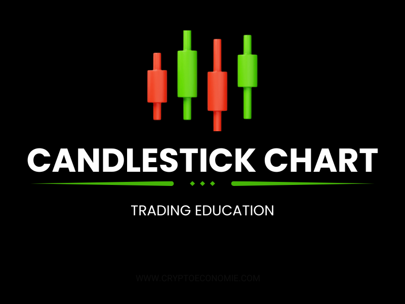
A candlestick chart is a type of financial chart that displays the price movements of an asset over a specific time frame. Unlike traditional line charts, which only show the closing prices, candlestick charts provide a more comprehensive view by illustrating four key price points for each time period:
Open - The price at which the asset began trading during the time frame. Close - The price at which the asset finished trading during the time frame. High - The highest price reached during the time frame. Low - The lowest price reached during the time frame.Each "candlestick" is composed of a body and wicks (or shadows). The body represents the range between the open and close prices, while the wicks show the high and low prices during that period. This visual representation helps traders quickly assess market sentiment and price behavior.
A Simple Example
Let’s consider a basic example to illustrate how candlestick charts work. Imagine we are looking at a candlestick chart for a stock over a one-day period:
Open Price: $100 Close Price: $105 High Price: $110 Low Price: $95In this scenario, the candlestick would be colored green (or white), indicating that the stock price closed higher than it opened. The body would stretch from $100 to $105, while the wicks would extend from $95 to $110.
How Does a Candlestick Chart Work?
Candlestick charts work by providing a visual representation of price movements over time. Each candlestick represents a specific time frame—this could be anything from minutes to days, weeks, or even months, depending on the trader's strategy.
Key Components of a Candlestick
Body: The thick part of the candlestick, showing the opening and closing prices. Wicks/Shadows: The thin lines extending above and below the body, indicating the highest and lowest prices reached during that period. Color: The color of the candlestick conveys whether the price moved up (often green) or down (often red) during the time frame.By observing the patterns formed by these candlesticks over time, we can gain insights into market trends and potential reversals. Traders often use specific patterns and formations to make informed decisions.
Types of Candlestick Charts
There are several types of candlestick charts we can explore:
Standard Candlestick Chart: This is the most common type, displaying individual candlesticks for each time frame. Heikin-Ashi Candlestick Chart: This variation uses modified calculations to smooth out price movements, making trends easier to identify. Renko Candlestick Chart: Instead of time-based intervals, Renko charts focus solely on price movement, filtering out minor fluctuations.Each type has its unique benefits and is suited to different trading strategies.
Pros and Cons of Candlestick Charts
Like any tool, candlestick charts come with their own set of advantages and disadvantages. Here’s a balanced look at both sides:
Pros
Visual Clarity: Candlestick charts provide a clear and visually appealing representation of price movements, making it easier to identify trends. Market Sentiment: They allow traders to gauge market sentiment quickly, enabling informed trading decisions. Versatile: Candlestick charts can be used across various time frames, making them suitable for day traders and long-term investors alike. Pattern Recognition: Certain candlestick patterns, such as doji, hammer, or engulfing patterns, can signal potential reversals or continuations, enhancing trading strategies.Cons
Learning Curve: For beginners, understanding candlestick patterns can be challenging and may require practice and education. False Signals: Like any technical analysis tool, candlestick charts can sometimes provide false signals, leading to incorrect trading decisions. Subjectivity: Interpretation of patterns can vary among traders, which may lead to different conclusions about market direction.Frequently Asked Questions (FAQs)
Q1: Can I use candlestick charts for any asset?
A1:Yes! Candlestick charts can be used for stocks, commodities, forex, and cryptocurrencies, making them a versatile tool for any trader.
Q2: What is the best time frame for candlestick charts?
A2: The best time frame depends on your trading strategy. Day traders may prefer short time frames (like 1-minute or 5-minute charts), while long-term investors may choose daily or weekly charts.
Q3: How can I learn more about candlestick patterns?
A3: There are many resources available, including books, online courses, and tutorials. Practicing with real charts can also help solidify your understanding.
Q4: Are candlestick charts suitable for beginners?
A4: While there is a learning curve, many beginners find candlestick charts intuitive once they understand the basics. Starting with simple patterns can be a great way to ease into trading.
Conclusion
In conclusion, candlestick charts are a powerful tool that can enhance our understanding of price movements in the financial markets. They offer a friendly and visual way to interpret complex data, making them popular among traders of all levels.
By familiarizing ourselves with how they work, the different types available, and their pros and cons, we can better equip ourselves to make informed trading decisions.
So, whether we are seasoned traders or just starting our journey, embracing the world of candlestick charts can pave the way for a more strategic approach to trading. Happy charting!
Related News


Add a Comment
Please login to your account to post a comment.
Trump promise to give an important government position to Elon Musk
2024-09-06 21:17:00

BlackRock to launch its first Ethereum-based tokenized fund.
2024-03-21 15:28:00

Crypto Dominates The Headlines As Other Markets Expect Corrections
2023-10-11 22:08:02

Hamster Kombat is not a scam. The new generation of millionaires
2024-09-01 06:27:00
A Golden year for gold Could Bitcoin reach new price highs following gold lead?
2024-09-27 07:39:00
MANSA Supplies DeFi Liquidity to Bitmama for Digital Crypto Cards
2024-09-04 10:33:00
Trump owns $5 million in Ether and earns from NFT licenses.
2024-08-18 06:29:00

Elon Musk sues Sam Altman, OpenAI over agreement breach
2024-03-01 16:12:00
Notcoin is preparing to launch an exciting new web3 game.
2024-08-12 05:11:00

what is futures trading? with simple examples
2024-01-14 08:49:00

Web 3! Advertising slogan or magic
2024-07-08 07:29:00


cryptoeconomie is an independent media outlet covering the cryptocurrency industry. Its journalists adhere to a strict set of editorial policies. cryptoeconomie has adopted a set of principles aimed at ensuring the integrity, editorial independence and freedom from bias of its publications. cryptoeconomie provides essential analysis of the cryptocurrency market. Our goal is to inform, educate and share valuable information with our readers. Our editorial content is based on our passion for providing unbiased news, in-depth analysis, comprehensive cryptocurrency price charts, insightful opinions, as well as regular reporting on the social transformation that cryptocurrencies are bringing. We believe that the world of blockchain and cryptocurrencies will grow exponentially and become an integral part of our daily lives. We work every day to help educate our readers and raise awareness of the complexities and benefits offered by today’s digital revolution.
- NFT
- Defi
- Metaverse
- News
- Web3
- Crypto Exchanges News
- Stablecoins
- Altcoins
- Bitcoin
- Technologi
- Artificial Intelligence
- Crypto Learning
- Crypto Glossary
- Crypto Exchanges Training
- Ethereum
- Solana
- Regulation
- Crypto Reviews
- Centralized Exchanges
- Decentralized Exchanges
- Crypto Wallet
- Crypto Investment Training
- Trading Education
- Crypto Projects
Comments